# React JS
# Getting started
# Install NodeJS
Download and install nodeJS (opens new window)
# Create react app
Run the following command to init a basic react app (opens new window)
npx create-react-app [my-app]
# Run react app on local dev server
Run the following command to init a basic react app (opens new window)
cd [my-app]
npm start
# Install react dev tool
Install chrome extension for react dev tools (opens new window)
# Install Bootstrap
Stop local server and run the following CLI command. (to confirm check node_modules/bootstrap/dist/css/bootstrap.min.css
)
npm install bootstrap
TIP
*Note the bootstrap npm package has been added to the package.json dependencies array and installed (added) in the node_modules directory.
Import bootstrap/dist/css/bootstrap.min.css into App.js
App.js
import "bootstrap/dist/css/bootstrap.min.css";
import "bootstrap/dist/js/bootstrap.min.js";
import "bootstrap/dist/js/bootstrap.bundle.min";
import "bootstrap-icons/font/bootstrap-icons.css";
Install chrome extension for react dev tools (opens new window)
# Introduction to ReactJS
# Anatomy of React App
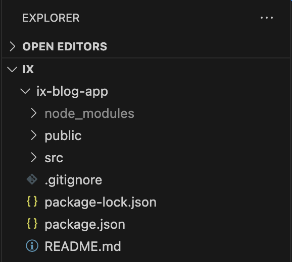
# node_modules
This is where all the external libraries that we use are. When you install a new library using npm install (or npx) then it will put it there.
# public
This is the entry-point (index.html). This is the single page that is rendered in our SPA. One element in the body:
<div id="”root”"></div>
# src/
This is our code 😃
src/index.js is the entry point for React. Here ReactDOM is imported and the ReactDOM.createRoot method is executed passing in the <div id="root"></div> DOM element in index.html. This instantiates an instance of the ReactDOM root. The root.render method is the executed which passes in App.js, which is where we will write our app code to update the root element using React.
import React from "react";
import ReactDOM from "react-dom/client";
import App from "./App";
import "./index.css";

const root = ReactDOM.createRoot(document.getElementById("root"));
root.render(
  <React.StrictMode>
    <App />
  </React.StrictMode>
);
# package.json
Manifest file of any Node.js project and contains the metadata of the project. Defines project name, version, scripts, author, etc. Most importantly defines all dependencies and dev-dependencies for node project.
{
  "name": "ix-blog-app",
  "version": "0.1.0",
  "private": true,
  "dependencies": {
    "@testing-library/jest-dom": "^5.17.0",
    "@testing-library/react": "^13.4.0",
    "@testing-library/user-event": "^13.5.0",
    "react": "^18.2.0",
    "react-dom": "^18.2.0",
    "react-scripts": "5.0.1",
    "web-vitals": "^2.1.4"
  },
  "scripts": {
    "start": "react-scripts start",
    "build": "react-scripts build",
    "test": "react-scripts test",
    "eject": "react-scripts eject"
  },
  "eslintConfig": {
    "extends": ["react-app", "react-app/jest"]
  },
  "browserslist": {
    "production": [">0.2%", "not dead", "not op_mini all"],
    "development": [
      "last 1 chrome version",
      "last 1 firefox version",
      "last 1 safari version"
    ]
  }
}
Package-lock.json is automatically generated for any operations where npm modifies either the node_modules tree, or package.json. It describes the exact tree that was generated, such that subsequent installs are able to generate identical trees, regardless of intermediate dependency updates.
# README.md
A README is a text (markdown) file that introduces and explains a project. It contains information that is commonly required to understand what the project is about.
# JSX
Fundamentally, JSX just provides syntactic sugar for the React.createElement(component, props, ...children) function.
# Syntax
function MyButton() {
  return <button style={{ color: "blue", shadowSize: 2 }}>I'm a button</button>;
}
export default function MyApp() {
  return (
    <div>
      <h1>Welcome to my app</h1>
      <MyButton />
    </div>
  );
}
TIP
Notice that
The JSX code:
<MyButton />
compiles into:
React.createElement(button, {style={{color:"blue",shadowSize:2}}}, "I'm a button");
# One Top Level Element
The HTML code must be wrapped in ONE top level element. So if you like to write two paragraphs, you must put them inside a parent element, like a div element.
const Headings = (
  <div>
    <h1>Heading</h1>
    <h4>Subheading</h4>
  </div>
);
Alternatively, you can use a "fragment" to wrap multiple lines. This will prevent unnecessarily adding extra nodes to the DOM.
A fragment looks like an empty HTML tag: <></>.
const Headings = (
  <>
    <h1>Heading</h1>
    <h4>Subheading</h4>
  </>
);
# Styling
Inline:
const Heading = <h1 stye={{ fontSize: "32px;" }}>Hello World</h1>;
The class attribute is a much used attribute in HTML, but since JSX is rendered as JavaScript, and the class keyword is a reserved word in JavaScript, you are not allowed to use it in JSX. JSX solved this by using className instead. When JSX is rendered, it translates className attributes into class attributes.
import "./index.css";

const Heading = <h1 className="heading">Hello World</h1>;
Then you write the CSS rules for it in a separate CSS file:
.heading {
  font-size: 32px;
}
# Displaying Data:
JSX lets you put markup into JavaScript. Curly braces let you “escape back” into JavaScript so that you can embed some variable from your code.
export default function MyApp() {
  const user = {
    image: ""
    firstName: "Byron",
    lastName: "de Villiers",
    age: 31,
    email: "byron@mail.com",
  };
  return (
    <div>
      <h1>Welcome</h1>
      <h5>{user.firstName}</p>
    </div>
  );
}
# Conditional Rendering:
In React, there is no special syntax for writing conditions. Instead, you’ll use the same techniques as you use when writing regular JavaScript code.
function Login (){
  return(
    <div>
      <h1>
      Login Component
      </h1>
    </div>
  )
}

function Home (){
  return(
    <div>
      <h1>
      Home Component
      </h1>
    </div>
  )
}

export default function MyApp() {
  const user = {
    image: ""
    firstName: "Byron",
    lastName: "de Villiers",
    age: 31,
    email: "byron@mail.com",
    authenticated: false;
  };

 if(user.authenticated){
  return (
    <Home/>
  );
 } else{
  return (
    <Login/>
  );
 }
}
We can also use a ternary operator.
function Login (){
  return(
    <div>
      <h1>
      Login Component
      </h1>
    </div>
  )
}

function Home (){
  return(
    <div>
      <h1>
      Home Component
      </h1>
    </div>
  )
}

export default function MyApp() {
  const user = {
    image: ""
    firstName: "Byron",
    lastName: "de Villiers",
    age: 31,
    email: "byron@mail.com",
    authenticated: false;
  };

  return (
    <div>
    {
      user.isAuthenticated ?
        <HomePage /> :
        <LoginPage />
    }
    </div>
  )
# Rendering Lists:
You will rely on JavaScript features like array map() function to render lists of components.
export default function MyApp() {
  const blogs = [
  { id: 1, title: 'Javascript Fundamentals', },
  { id: 1, title: 'HTML and CSS',  },
  { id: 1, title: 'iX Boot Camp',  },
];

  return (
    <ul>
    {
      blogs.map(x=>{
        return (
          <li key={product.id}>
            {product.title}
          </li>
        )
      })
    }
    </ul>
  )
# Responding to events
In React, there is no special syntax for writing conditions. Instead, you’ll use the same techniques as you use when writing regular JavaScript code.
function MyButton() {
  function handleClick() {
    alert("You clicked me!");
  }

  return <button onClick={handleClick}>Click me</button>;
}
TIP
Notice how onClick={handleClick} has no parentheses at the end! Do not call the event handler function: you only need to pass it down. React will call your event handler when the user clicks the button.
# Props in JSX
You can pass any JavaScript expression as a prop, by surrounding it with {}. For example, in this JSX:
<MyComponent foo={1 + 2 + 3 + 4} />
TIP
Note: We'll go into more detail about props and state tomorrow.
# React Components
# Functions vs. Classes
Example of function component
export const Header = () => {
  return (
    <div>
      <h1>Hello World</h1>
    </div>
  );
};
Example of class component
export default class Header extends React.Component {
  render() {
    return (
      <div>
        <h1>Hello World</h1>
      </div>
    );
  }
}
# Navbar
In frontend/src/ create a components directory and add dir and a file called Navbar/index.js

import React from "react";

export default function Navbar() {
  return (
    <nav className="navbar navbar-expand-lg">
      <div style={{ margin: "0px 5%" }} className="container-fluid">
        <a className="navbar-brand" href="#">
          iX Software Engineering Blog
        </a>
        <button
          className="navbar-toggler"
          type="button"
          data-bs-toggle="collapse"
          data-bs-target="#navbarNav"
          aria-controls="navbarNav"
          aria-expanded="false"
          aria-label="Toggle navigation"
        >
          <span className="navbar-toggler-icon"></span>
        </button>
        <div className="collapse navbar-collapse" id="navbarNav">
          <ul className="navbar-nav ms-auto">
            <li className="nav-item">
              <a className="nav-link active" aria-current="page" href="#">
                Home
              </a>
            </li>
          </ul>
        </div>
      </div>
    </nav>
  );
}
# Heading
frontend/src/components/Heading/index.js
import React from "react";

export default function Heading() {
  return <p className="page-title">THE BLOG</p>;
}
frontend/src/components/Heading/index.css
.page-title {
  text-align: center;
  font-size: calc(100px + 2vw);
  font-weight: bold;
  border-top: 1px solid #9fa2a7;
  border-bottom: 1px solid #9fa2a7;
  margin: 16px 0px;
}
# Subheading
frontend/src/components/SubHeading/index.js
import React from "react";

export default function SubHeading({ subHeading }) {
  return <p className="page-subtitle">{subHeading}</p>;
}
TIP
Notice that data is being passed into this component from the parent component. These data is called "props" (properties). We will learn more about properties tomorrow.
frontend/src/components/SubHeading/index.css
.page-subtitle {
  margin-top: 32px;
  font-size: 24px;
  font-weight: bold;
  text-align: left;
}
# BlogGrid
frontend/src/components/BlogGrid/index.js
import React from "react";

import "./index.css";

import BlogItem from "../BlogItem";

export default function BlogGrid({ blogPosts }) {
  if (!blogPosts || !blogPosts.length) {
    return null;
  }

  return (
    <>
      <div className="blog-grid-container">
        <div className="item-1">
          {blogPosts.length > 0 && (
            <BlogItem
              imageOrientation={"top"}
              index={0}
              blogPost={blogPosts[0]}
            />
          )}
        </div>

        <div className="right-block">
          {blogPosts.length > 1 && (
            <div className="item-2">
              <BlogItem
                imageOrientation={"left"}
                index={1}
                blogPost={blogPosts[1]}
              />
            </div>
          )}

          {blogPosts.length > 2 && (
            <div className="item-3">
              <BlogItem index={2} blogPost={blogPosts[2]} />
            </div>
          )}
        </div>
      </div>
      {blogPosts.length > 3 && (
        <div className="item-4">
          <BlogItem index={3} blogPost={blogPosts[3]} />
        </div>
      )}
    </>
  );
}
TIP
*Note: This component makes use of another component called BlogItem.
frontend/src/components/BlogGrid/index.css
.blog-grid-container {
  padding: 16px 0px;
  width: 100%;
  display: flex;
  height: 550px;
}

.right-block {
  width: 50%;
  display: block;
}

.item-1 {
  width: 50%;
  padding-right: 12px;
}

.item-2 {
  height: 50%;
  padding-left: 12px;
  padding-bottom: 12px;
}

.item-3 {
  height: 50%;
  padding-left: 12px;
  padding-top: 12px;
}

.item-4 {
  padding: 16px 0px;
  width: 100%;
  height: 246px;
}

@media (max-width: 1024px) {
  .blog-grid-container {
    display: block;
    height: auto;
  }

  .right-block {
    width: 100%;
  }

  .item-1 {
    width: 100%;
    padding-right: 0px;
  }

  .item-2 {
    padding-left: 0px;
    padding-bottom: 0px;
  }

  .item-3 {
    padding-left: 0px;
    padding-top: 0px;
  }

  .item-4 {
    padding: 0px;
    height: 100%;
  }
}
# Blog Item
frontend/src/components/BlogItem/index.js
import React from "react";

import BlogItemText from "../BlogItemText";

import "../../App.css";
import "./index.css";

export default function BlogItem({
  index,
  blogPost,
  setBlog,
  imageOrientation,
}) {
  if (imageOrientation === "top") {
    return (
      <div
        key={index}
        className="card-1"
        onClick={() => console.log("TODO: nav to blog")}
      >
        <img src={blogPost.image} className="card-img-top" alt="..." />
        <div className="card-text-bottom">
          <BlogItemText
            blogPost={blogPost}
            headerFontSize="20px"
          ></BlogItemText>
        </div>
      </div>
    );
  } else {
    return (
      <div
        key={index}
        className="card-2"
        onClick={() => console.log("TODO: nav to blog")}
      >
        <img src={blogPost.image} className="card-img-left" alt="..." />
        <div className="card-text-right">
          <BlogItemText
            blogPost={blogPost}
            headerFontSize="20px"
          ></BlogItemText>
        </div>
      </div>
    );
  }
}
TIP
*Note: This component makes use of another component called BlogItemText.
frontend/src/components/BlogItem/index.css
.card-1 {
  height: 100%;
  overflow: hidden;
  position: relative;
}

.card-1:hover {
  cursor: pointer;
  box-shadow: 0px 0px 15px rgba(0, 0, 0, 0.3);
}

.card-2 {
  height: 100%;
  display: flex;
  overflow: hidden;
  position: relative;
}

.card-2:hover {
  cursor: pointer;
  box-shadow: 0px 0px 15px rgba(0, 0, 0, 0.3);
}

.card-img-top {
  width: 100%;
  height: 50%;
  object-fit: cover;
}

.card-img-left {
  width: 50%;
  height: 100%;
  object-fit: cover;
}

.card-text-bottom {
  height: 100%;
  text-align: left;
  padding: 8px;
}

.card-text-right {
  text-align: left;
  height: 100%;
  width: 50%;
  padding: 8px;
}

@media (max-width: 768px) {
  .card-2 {
    display: block;
  }

  .card-img-left {
    width: 100%;
    height: 50%;
  }

  .card-text-right {
    width: 100%;
    margin-left: 0;
  }
}
# Blog Item Text
frontend/src/components/BlogItem/index.js
import React from "react";

import Categories from "../Categories";
import "./index.css";

export default function BlogItemText({ blogPost, headerFontSize }) {
  return (
    <div>
      <div style={{ display: "flex" }}>
        <p className="date-author-text">
          {blogPost.author.firstName} {blogPost.author.lastName}
        </p>
        <div className="dot-divider"></div>
        <p className="date-author-text">
          {blogPost.createdAt.substring(0, 10)}
        </p>
      </div>
      <p
        style={{
          fontSize: headerFontSize,
          fontWeight: "bold",
          textAlign: "left",
        }}
      >
        {blogPost.title}
      </p>
      <p style={{ fontSize: "16px", color: "#667085", textAlign: "left" }}>
        {blogPost.description.substring(0, 100)}...
      </p>
      <Categories blogPost={blogPost} />
    </div>
  );
}
TIP
*Note: This component makes use of another component called Categories.
frontend/src/components/BlogItemText/index.css
.date-author-text {
  font-size: 14px;
  color: #6941c6;
  font-weight: bold;
}

.dot-divider {
  margin: 9px 4px;
  width: 4px;
  height: 4px;
  background: #6941c6;
  border-radius: 50%;
}
# Categories
frontend/src/components/Categories/index.js
import React from "react";

export default function Categories({ blogPost }) {
  return (
    <div className="flex-wrap">
      {blogPost.categories.map((category, index) => {
        return (
          <p
            key={index}
            className="category-tag"
            style={{
              color: category.color,
              backgroundColor: category.color + "33",
            }}
          >
            {category.title}
          </p>
        );
      })}
    </div>
  );
}
frontend/src/components/Categories/index.css
.category-tag {
  margin: 2px 2px;
  padding: 4px 8px;
  font-size: 14px;
  text-align: left;
  border-radius: 14px;
  white-space: nowrap;
}
# Category List
frontend/src/components/CategoryList/index.js
import React from "react";

import "./index.css";

export default function CategoryList({ categories }) {
  return (
    <div className="category-list">
      {categories.map((category) => {
        return (
          <button
            key={category.id}
            className="card"
            style={{ borderRadius: "0px", border: "none" }}
            onClick={() => {
              console.log("TODO: Navigate to categories page");
            }}
          >
            <div
              className="card-body"
              style={{
                backgroundColor: category.color + "33",
                position: "relative",
                zIndex: 0,
              }}
            >
              <h5 className="card-title">{category.title}</h5>
            </div>
            <div className="card-body">
              <p className="card-text">
                {category.description.substring(1, 100)} ...
              </p>
            </div>
          </button>
        );
      })}
    </div>
  );
}
frontend/src/components/CategoryList/index.css
.category-list {
  padding: 16px 0px;
  width: 100%;
  display: grid;
  grid-template-columns: 32% 32% 32%;
  grid-gap: 2%;
  row-gap: 32px;
}

.card:hover {
  cursor: pointer;
  box-shadow: 0px 0px 10px rgba(0, 0, 0, 0.3);
}

@media (max-width: 992px) {
  .category-list {
    grid-template-columns: 49% 49%;
  }
}

@media (max-width: 768px) {
  .category-list {
    grid-template-columns: 100%;
  }
}
# Footer
frontend/src/components/CategoryList/index.js
import React from "react";
import { Link } from "react-router-dom";
export default function Footer() {
return (
<div className="container mt-5">
<footer className="py-3 my-4">
<ul className="nav justify-content-center border-bottom pb-3 mb-3">
<li className="nav-item">
<Link to="/home" className="nav-link px-2 text-muted">
Home
</Link>
</li>
<li className="nav-item">
<Link to="/categories" className="nav-link px-2 text-muted">
Categories
</Link>
</li>
<li className="nav-item">
<Link to="/blogs" className="nav-link px-2 text-muted">
Blogs
</Link>
</li>
</ul>
<p className="text-center text-muted">© 2024 The Blog App, Inc</p>
</footer>
</div>
);
}
# Update HomePage Component
frontend/src/components/HomePage/index.js
import React from "react";

import Heading from "../Heading";
import Navbar from "../Navbar";
import BlogGrid from "../BlogGrid";
import Footer from "../Footer";
import SubHeading from "../SubHeading";
import CategoryList from "../CategoryList";

// Week 1: Import the blogPosts and categories from the dummy-data.json file
const data = require("../../dummy-data.json");
const blogs = data.blogPosts.reverse();
const categories = data.categories;

export default function HomePage() {
  return (
    <>
      <Navbar />
      <div className="container">
        <Heading />
        <SubHeading subHeading={"Recent Blog Posts"} />
        <BlogGrid blogPosts={blogs}></BlogGrid>
        <SubHeading subHeading={"Categories"} />
        <CategoryList categories={categories}></CategoryList>
        <Footer />
      </div>
    </>
  );
}
# Update App.js
frontend/src/App.js
import HomePage from "./components/HomePage";

function App() {
  return (
    <div className="App">
      <HomePage />
    </div>
  );
}